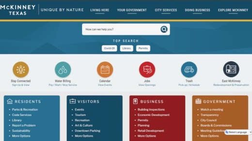
The new website went live Dec. 7 after a five-year run since the last overhaul. In a typical redesign, which takes place about every five years as an industry standard, sites make minor adjustments, such as updating graphics and colors, Website Specialist Valerie McKito said.
“Going into our redesign, however, we decided to make some substantial changes to make it easier for the public to navigate the website,” she added.
Like in routine updates, city staff updated colors and made sure they were Americans with Disabilities Act compliant for users with colorblindness and other conditions. The site is also formatted for people who use screen readers. But much of the redesign was focused on functionality.
Due to the increase in mobile visitors, one of the staff’s top priorities was making the website mobile friendly, McKito said.
In 2015, 87% of visitors were accessing the website from a desktop computer. In 2020, that percentage dropped to 45%, according to city data.
“What we've done is to make sure that [the site] looks good with the redesign, whether you're looking at it from desktop or from mobile,” McKito said.
The new website features an updated megamenu, or the toolbar across the top of the screen with various navigation categories. McKito said updating those categories made navigation easier for residents because the previous labels were centered around city employees.
Visitors will also notice the absence of the banner photo that used to be a landmark of the city homepage. The decision to remove the photo was a combination of banners going out of style and the slower loading times it caused for mobile users. “We all know in mobile that if a site takes too long to load, we just click off of it,” McKito said. “The last thing we want to do is lose our residents before we even get them close to the information that they're looking for.”
Each change was consistent across desktop and mobile, which will help the city’s customer service representatives when they assist website visitors who call in for technical assistance, McKito said. Previously, some of the pages did not appear the same for desktop and mobile users, which complicated the support process. CivicPlus, the city’s website vendor, used McKinney’s site as an example for local governments across the country after the 2016 redesign. McKinney was one of the first city sites to use a large banner photo on its homepage, McKito said.
“We've heard from our vendor that they're planning on using our website again as an example of how to go to meet our communities where they're at and where they're moving on technology,” McKito said. “So that's pretty exciting that we're on the cutting edge of it again.”


